
Blog article
Mobile-first indexing and how it affects SEO
Estimated reading time: 9 minutes

In this article, we will explain everything you need to know about mobile-first indexing.
You’ll find out:
- what mobile-first indexing is
- how mobile-first indexing affects SEO
- the most common mistakes webmasters are making
- how you can improve your indexing
Google’s algorithm is all about trends and innovations. To be visible on the internet, you need to adjust and change with every minor or major update. Mobile-friendly indexing is just one of these recent updates.
What is “mobile-first indexing”?
Mobile-first indexing is a method used by Google to crawl web pages with mobile versions as a priority. The mobile version serves as both a starting point for Google’s crawl bot and as a major determinant for a page’s ranking.
If you’ve already seen some traffic from “Smartphone Googlebot”, it means that this type of indexing has already started.
The term “mobile-first” doesn’t mean that Google will only be looking for the mobile version of your site. If you still don’t have a mobile version, a desktop version will be used instead. However, this will greatly influence your ranking, since the algorithms are working in favor of lite, mobile-friendly options.
However, it’s not just about the algorithm—a well-optimized mobile version is a must. This is because of the overall UX and the number of users browsing from portable devices.
Before mobile-first indexing, Google used to crawl the desktop version first. According to the information that’s gathered on a desktop site, rankings for both desktop and mobile were determined.
Now it is just the opposite. Google will crawl sites using a mobile bot and determine the ranking entirely from that point of view. Google will switch to desktop only if the mobile version is nonexistent. Yet once Google switches to looking at the desktop version, a lack of mobile optimization will result in a poor ranking, even if your site has top-notch desktop optimization.
Let’s not say that desktop optimization will become useless, rather that desktop-only optimization now makes little sense.
Why did google switch to mobile-first indexing?
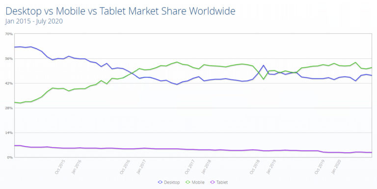
Back in 2016, Google claimed that the majority of people were searching and browsing using mobile devices. It was at this time that they started experimenting with a fresh ranking system called mobile-first indexing.
Although for many, mobile-first indexing is already in full swing, Google has announced a complete switch to mobile-first indexing for all websites. The change was originally scheduled for September 2020, but as a result of the COVID-19 pandemic’s influence on businesses all over the globe, it has been postponed to March 2021.
So if by now you are still not fully mobile-optimized, now is your last chance.
Are there now two indexes, one for mobile and another for web?
When people talk about mobile and desktop indexing, this is a common misunderstanding. Many still think that rankings are separate for mobile and desktop searches. This, however, is not true. There is only one indexing ranking for both mobile and desktop versions. The terms “mobile-first” or “desktop-first” refer to which one has priority.
Google’s final goal is to have uniform results with the same content whether you browse on a PC, laptop, tablet or smartphone.
Here is a tweet from Google’s publicist, Danny Sullivan, confirming that only one indexing exists. What’s interesting is that he also mentioned how, at the time of tweeting, most sites use desktop-first indexing.
Now, in 2020, most sites use mobile-first indexing, and over the next few years, perhaps the term “mobile-first” will evolve into “mobile-only indexing”.
How is mobile-first indexing affecting SEO?
We’ve partially covered this in our general explanation about mobile-first indexing, but let’s check how it affects SEO and SERP rankings once again.
The goal of rolling out mobile-first indexing was to determine a site’s value, rankings and similar attributes from the same perspective as the majority of users.
Since most users are browsing on mobile devices, Google created an AI crawl bot that judges a site from the same mobile perspective. So, according to the content, speed and overall optimization that the mobile crawl bot sees, Google will determine your SERP ranking.

A significant difference in terms of technical SEO rules comes with collapsed or hidden content. Unlike on the desktop version, hidden content on mobile indexing will be treated the same as a fully visible one. This is due to the importance of economic screen management, and it applies to everything “hidden” behind the boxes, drop-down lists, expandable menus, etc.
How do I improve mobile-first indexing?
If you have a responsive site with the same desktop and mobile versions, there’s no need to worry. Yet, the truth is that many webmasters are still struggling to balance the two.
A common misconception is that these two versions should be identical, when in actual fact, this isn’t the best idea. The goal is to provide the best browsing experience in terms of speed and accessibility while displaying the same content.
So, if you have a responsive site, your biggest concern should be loading speed and dynamic objects such as images and tables.
However, if you still have separate mobile and desktop versions, this is how you can improve mobile-first indexing:
Structured data
The same as with content, structured data needs to be the same on mobile and desktop sites. Google suggests prioritizing Breadcrumb, Product and VideoObject structured data.
If you’re using Data Highlighter for structured data, check the dashboard for frequently occurring errors.
Googlebot accessibility
If you want the site to be properly indexed, Google bot should have full access to the mobile version as well. Meta robot tags on mobile and desktop should match every time. Noindex and nofollow are especially important. If these are not configured properly, Google bot may fail to crawl these pages.
Check if any of the URLs that you would like to have crawled are blocked. If there are any URLs in the disallow directive, Google will skip them when carrying out its research.
Visual content ‒ images
Modern mobile devices typically have high-resolution displays. You need to provide high-quality and high-resolution images for your mobile version.
Some formats and tags are still unsupported. Check if you’re using them properly and if they work combined. For example, although .jpg is supported, a crawl bot will be unable to index it if it is under the tag.
As with the rest of the content and structured data, alt text for images should match on mobile and desktop. Google still struggles with indexing if descriptive alt text is not the same on both.
Put the same amount of effort, if not more, into providing quality content for mobile sites. Also, the same titles, captions, file names and text should be used.
Google has published an official in-depth explanation about image best practices.
Visual content – videos
This is a fairly similar situation to image files. Watch out for whether formats are supported, and put them in proper HTML tags (<video>, <embed>, <object>).
Structured data should match on mobile and desktop. Also, refrain from using URLs that change whenever the page loads. If you don’t, Google will not be able to index it properly.If you place a video at the bottom of a page where the user needs to scroll down a lot to find it, this will harm the ranking of the video itself. It’s best practice to put it where it is visible as soon as the page loads.Here is Google’s article on the best video practices you should be following.
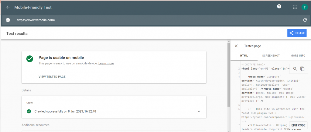
How to check if your pages are mobile-friendly
Now and then, Google really likes to change its rules, terms and algorithms, causing a strong headache for webmasters, SEO experts, web designers, developers and many more.On the plus side, these updates often come with a set of guidelines and tools that can help us move along.You can check if your site is mobile friendly with this tool. If the page is not yet live, you can simply copy the code.
What are the most common mistakes with mobile-first indexing?
The ultimate piece of advice we can give you is to follow Google’s official guidelines for proper mobile-first optimization. If you continue to have certain problems, the chances are that you’re making some of these mistakes:
- Problems with ads, missing content, alt text, titles and descriptive elements
For best ads positions, stick to the Better Ads Standards.The content should be the same as on your desktop site and nothing should be missing.Headlines and titles should also be the same.Use proper descriptive elements where applicable, such as titles, captions, filenames, etc.
- Structured data is missing
Structured data needs to have the same structure on both versions. Google wants to test structured data on both mobile and desktop simultaneously and compare results.A URL inspection tool can also help you to see if your content is discoverable to crawlers.
- Robots.txt blocked mobile page
See if there are any unnecessary directives in robots.txt that are blocking the crawlers for the mobile version. The same rules should be used in both the mobile and desktop versions.
- All redirections from desktop lead to the mobile home page
If this is happening, it means that you haven’t fully migrated content to the mobile version of your site. For each desktop page you have, you also need an equivalent mobile version.
Conclusion
Mobile-first indexing was a real innovation, and it showed how Google indexes and perceives web pages. Now, a couple of years later, most of you are familiar with all the necessary rules for running a well-optimized website.The solution is often found in responsive web pages. Like this, you’re left free from excessive optimization and hard-labor adjustments.If you’re still forced to optimize manually, you can use our useful explanation and advice to help you achieve an optimum, mobile-friendly performance.
About The Author
How can Verbolia help your e-commerce platform.

