Blog article
What Is a Good Ecommerce Landing Page?
Estimated reading time: 6 minutes

Many people associate landing pages with offers outside the e-commerce world, leaving many e-commerce businesses to overlook it as a potential marketing asset.
However, a well-designed e-commerce landing page can give your conversions a dramatic boost on a particular product.
Below, we’ll look at the benefits of e-commerce landing pages and how they’re different from product pages, then explore some best practices to follow when you build your own landing pages.
E-commerce landing pages vs. Product pages
E-commerce landing pages—or any landing pages, for that matter—are designed with a single offer and goal in mind. They should be SEO-optimized, but the primary focus is to convert customers who land on the page right then and there—usually from search engine advertising (SEA) campaigns.
Product pages, on the other hand, tend to be centered on informing the customer about the product. Yes, the customer can buy from product pages. However, providing product information and optimizing for SEO are the focus.
In theory, you can use a product page as a landing page. However, it’s not ideal in most cases.
Why should you use an e-commerce landing page?
E-commerce landing pages offer plenty of uses and advantages—the main being that you can flesh out the features, benefits, and other information buyers need to know to buy. As a result, they can boost conversions on whichever product the landing page is for.
They’re especially great for new products and high-ticket items. New products need explaining so the customer knows more about them, while high-ticket items require more persuasion to land the sale.
E-commerce landing pages can even help your SEO. When done right, these pages keep bounce rates low and dwell time high while ranking for specific keywords.
E-commerce landing page best practices
Creating a high-converting eCommerce landing page is all about user experience. Make it simple and easy for the user to navigate, and they’re more likely to stay on your page and buy.
With that in mind, build your page with these best practices in mind.
1. Write an attention-grabbing headline
The headline is perhaps the most important piece of your landing page. Its goal is to capture the reader’s attention and get them to keep scrolling. Fail at this, and you’ll lose the reader on arrival.
A good rule of thumb is to include the main benefit of your product in the headline. Alternatively, you could grab the reader’s attention by calling out the big problem your product solves.
Check out this example from Blue Apron, a service that delivers ingredients you need to cook a variety of dishes:
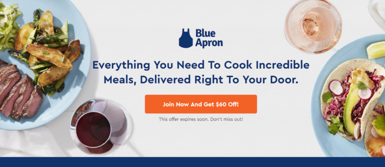
Notice how the entire headline is the main selling point of the subscription they sell. There isn’t any subheading copy in this instance—as it really isn’t needed—but you may want to add some.
Here’s another example from Claim Compass, a company that helps you get compensation if your flight’s delayed:

It’s not ecommerce, but the idea works. Tons of travelers hate delayed flights. This headline grabs a lot of attention and keeps people reading.
Notice how they continue that idea with the subheading copy, explaining the primary benefit Claim Compass offers. In this case, adding the extra copy makes sense, since the heading only conveys the problem, not the solution.
2. Stick to one clear offer . . .
The more choices you give customers, the harder it’ll be for them to make a decision. In fact, they might give up on the purchase completely.
So yes, it might be tempting to try and cram more offers in to boost sales—but you’ll actually see the opposite.
Instead, stick with one clear offer. Focus your copy and design around selling this offer. This will make the decision easier for the customer.
3. But include multiple CTA buttons …
One offer doesn’t mean one button. Instead, you should provide your customer as many opportunities to click as possible. The easier you make it to buy, the more likely you’ll close the sale.
Look at what this watch brand does:
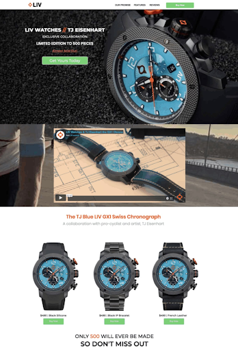
They’re only selling one product here (just with different watch bands/bracelets), yet they include multiple CTAs to make it as easy as possible to buy.
4. Keep the design simple
Simpler is almost always better when conversion is the goal. Landing pages should pull the reader down the page, which means creating a clean and distraction-free eCommerce landing page design.
That means, aside from the headline and CTAs, you shouldn’t include more than some quick descriptive copy, relevant images or a video, and a few testimonials.
On top of that, make sure the design works well on mobile. It’ll improve bounce rates while also giving your landing page an SEO boost.
5. Optimize for SEO and SEA
Although landing pages aren’t designed inherently with SEO in mind, you should still optimize for SEO alongside SEA.
Some SEO matters complement good eCommerce landing page design. A landing page that’s fast and offers value to readers will help your SEO.
But in the copy itself, you must strike a balance between:
- the SEO and SEA keywords you want to rank for,
- persuasive copywriting,
- and a user-friendly design.
Getting this right can put your landing page front and center, driving plenty of buyer-ready-leaning traffic to your products.
Nailing all three of these on your own is quite a challenge . . .
But not if you automate the process with Verbolia.
Verbolia can pump out landing pages optimized for SEO and SEA in seconds—all you need to provide is your list of desired keywords. These landing pages will drastically increase paid search conversions while pushing you higher in the search results to drive more organic traffic.
Plus, you can monitor each page’s success with Verbolia’s built-in dashboard.
Schedule a free demo to see how Verbolia does all this with almost no effort on your part.
About The Author
How can Verbolia help your e-commerce platform.