Blog article
Anatomy of a perfect product page for e-commerce
Estimated reading time: 7 minutes
Product pages are arguably the most crucial elements of your website. But, before diving into creating the perfect product page, it’s important to consider the user’s journey. It’s common for a product page to be the first point of contact with your website, especially if a user arrives via Google Shopping or clicks on a Facebook ad. This scenario requires designing pages that cater specifically to first-time visitors.
Understanding the user’s journey is crucial, as it shapes the strategic design of your product pages to maximize engagement and ultimately drive conversions. Recognizing the significance of this journey allows us to focus on creating pages that not only captivate but effectively convert your site’s visitors into buyers. This involves strategically placing the “Add to Cart” button to immediately catch the consumer’s eye, providing comprehensive information about the product and brand, establishing trust through social proof, and employing strategies to enhance the average order value.
But that’s just the tip of the iceberg! To build a killer product page, there are certain elements to consider and specific features to add.
1. Clear and logical navigation
A typical ecommerce store is comparatively large, with anywhere from a few hundred to a few million pages.
In this context, it is essential for online stores to have a well-structured and logical navigation path to retain visitors on their sites and guide them quickly to the right categories. In addition, they make it easier for search engine spiders to crawl and index your online store, which saves your crawling budget and speeds up the process of getting your new pages into the search engine results pages (SERPs).
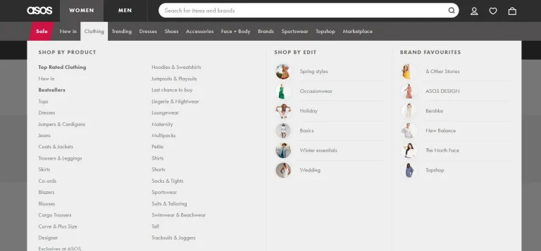
📷 Source : Asos
2. Breadcrumbs
“Breadcrumb” is an unusual name for the navigation chain that can be presented on a website to improve its usability.
Breadcrumb navigation allows users to better understand the relationship between the page they are on (such as a category or product page) and higher level pages.
In fact, a breadcrumb trail is a small menu showing the complete path from the current page to the home page. On multi-page portals with an extensive section structure, breadcrumbs is a mandatory attribute for user convenience. It provides users a quick way to browse through the site.
Generally, the breadcrumb trail is visible at the top of the page. Remember that navigation is available, but it is not necessarily the central and most important element of the site. It should be an unobtrusive assistant. Sequence is important – if you use this type of navigation on one page, you should use it throughout your site. Breadcrumb navigation is very useful, but it can’t replace the main site navigation!
Besides, search engines love breadcrumbs on large websites because, like clear navigation, they outline the structure of your website neatly.
If you are not yet using breadcrumbs, you are passing up a great value from a usability and SEO perspective.
3. High-quality product images
If you want your website to generate more interest from visitors, it is essential to pay attention to the images of your products on your ecommerce website.
Visual content is literally the most eye- catching and powerful element of a website. A quality, well-advertised photo or video makes for a solid online product presentation for customers. Static product images are the most basic visual content that any retailer needs. Regardless of the type of product, an online store must have static product images. They should showcase the product and, at the same time, project the brand’s style. It goes without saying that a quality product image should be in high resolution and, of course, it should match the exact colors of the product. In addition, it is essential to showcase your product in use. Search engines prioritize pages with large, high-quality product images, which help visitors get a better idea of the item they are about to purchase.
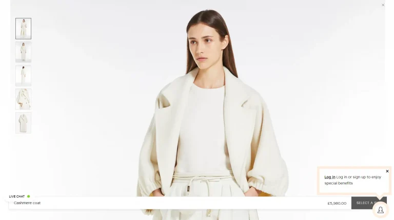
📷 Source : Max Mara
The problem is that high-resolution illustrations are relatively heavy. And in the world of graphics, size matters because it has a direct impact on page load speed. In fact, conversion rates drop by an average of 4.42% for every additional second of loading time. To counter this problem, it is recommended to use the WebP image format. Developed by Google, it reduces the size of image files by up to 34% without sacrificing quality compared to JPEG and PNG formats.
Below are some useful tools to optimize the size of image files:
- CompressPNG
- TinyJPG
- WebP Converter
In the case where product detail pages are used for paid campaigns like Google Shopping, it’s a bit different. When visitors land on these pages, they often lack familiarity with your brand and typically don’t engage deeply with the content, potentially leading to higher bounce rates. However, the importance of high-quality product images remains important. Yet, the specific positioning and size of these images play an important role in driving conversions. Testing various layouts is key to finding the optimal size and positioning for your main product image, leading to improved performance on your product detail pages. Consider, for instance, the category of shoes, where a larger image might outperform a smaller one. Conversely, in more technical categories like memory cards, an excessively large image may not be necessary for optimal performance.
Verbolia has developed a solution named Vmax facilitating easy A/B testing of different product page layouts. Through its automated testing feature, Vmax intelligently evaluates different layouts, finding the optimal configuration for each product page. This means you maximize both conversion rates and overall performance, ensuring every visitor is met with the most compelling layout tailored to their needs and preferences.
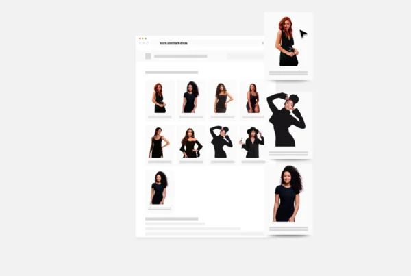
4. Product photos from different angles
When it comes to ecommerce, trust is more pivotal than price.
To entice your customers to take the leap of faith necessary for a transaction to take place, your product images must help your potential buyers learn everything they want to know about the item listed on the page without ever having to look at the product description.
Creatively using images to tell your product’s story builds trust in visitors to trust you with their money and greatly increases the likelihood that a passerby will turn into a paying customer. Your customers should feel like they are holding your product in their hands.
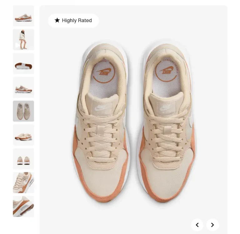
📷 Source : Nike
5. Product demo videos
A demo video can introduce a product or service to an audience of prospects. There are many types of product videos, but the good ones have some common characteristics. They are simple and concise. They tell a story that involves a problem. And they connect with viewers through emotion, honesty and often humor.
Demo videos allow someone unfamiliar with your product to explain how it works and provide them with the information they need to make a purchase decision.
According to Oberlo, visitors who watch product demo videos are 1.53 times more likely to buy than those who do not.
Demo videos explain features and benefits
Demo videos allow you to explain the features and benefits of your products in a way that doesn’t explicitly feel like selling. Throughout the demo, you can show what makes your product unique.
You can also show why specific features have been included and how they simplify the process of solving your customer’s problem.
6. Descriptive, bold main header
When a user arrives at your product page, they should immediately understand what they are looking at. The headline is the hook that grabs readers’ attention. It’s the first thing they notice before navigating to a product page. More often than not, it’s the only thing they read.
70% of people don’t read beyond the title. In other words, they only read the title and never consume the content.
A clear, bold header is essential for visitors and search engines to understand the main purpose of the page. If this is not the case on your website, your top priority should be to make it as clear as possible, as quickly as possible.
7. Review snippet
Review Snippets are the markup of your content with “structured data” that allows search engines to better understand and index that information. This schematic markup, generated solely from product reviews, is what helps you stand out in organic listings.
The rating and number of stars are additional useful information that will encourage users to trust your company earlier in their customer journey.
To benefit from Review Snippet stars, it is necessary to use the overall rating to tag your web page for product reviews.
Review Snippets can help you boost your SEO and optimize your click-through rate, consistently driving quality traffic to your e-commerce site. In short, a review snippet provides a quick overview of all reviews for a given product, including the number of reviews and the average rating.
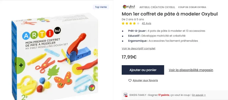
📷 Source : IDkids
8. Product availability
Choosing a product and finding out it’s out of stock is extremely frustrating for visitors – and it turns out that search engines hate it too. Google (and hopefully you) want your site visitors to have the best experience possible.
Getting them excited about a product and then dropping them is far from a positive experience and greatly increases the chances that that potential customer will walk away and never come back.
To prevent this from happening, your product page should contain a section, block, or snippet that tells your visitors and search engines if the product in question is available.
9. Well-written, customer-focused text
You know your customer better than anyone. You must write as if you were speaking directly to them.
What do they desire? How will this product improve their lifestyle? How will they feel using or wearing this item? Your words must also be powerful and effective if you want to captivate as many of your visitors as possible.
Copy is often neglected in e-commerce, but crafting it well is essential if you want to connect with potential buyers and turn them into loyal customers.
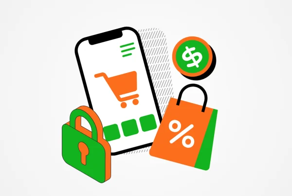
10. Multiple payment options and methods
By offering your customers more options to buy from you – whether in full or in installments – you open the door to more loyal prospects who may not have cash stashes on hand at the time.
If your brand cares about being more inclusive (and making more money), payment flexibility is a great way to do that.
In this regard, the more ways your customer can pay you, the more likely they are to do so. Try to add a number of payment options to make the payment process as seamless as possible:
- American Express
- Apple Pay
- Google Pay
- Visa Checkout
- MasterCard payment
In addition, make sure to remove any obstacles that get in the way of your visitors’ path to a purchase:
- View payment methods
- Offer a secure payment
- Optimize the checkout process
Buy Now, Pay Later
Buy Now, Pay Later (BNPL) is a point-of-sale financing solution that has gained popularity in recent years, especially among the younger generation.
BNPL solutions have emerged to address financing issues such as complexity and high credit card interest rates and fees.
So how does BNPL work ? At checkout, buyers usually have the option of receiving their product immediately, but paying in full after 30 days or in installments. They also usually have the option of making three or four installment payments at regular intervals, charged directly to their payment card.
In both cases, there are no additional fees or interest to pay, as long as they pay on time.
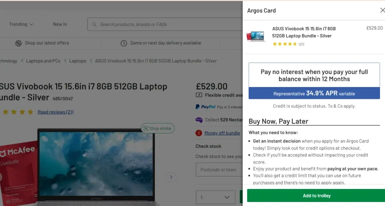
📷 Source : Argos
11. Customer satisfaction guarantee
Product close-ups, size guides, augmented reality… No matter how much you help customers
visualize your products, online shopping will always involve some risk for consumers. After all, they can touch, feel and try the products they are buying!
That’s why there’s a greater chance that an online order won’t meet their expectations or needs than in bricks and mortar stores.
By addressing your consumers’ perceived risk, you’ll minimize their concerns and help them shop with more confidence. And a strong satisfaction guarantee is key to eliminating that risk.
The way you frame and offer a guarantee can also have a significant impact on your conversion rates.
So you can always go beyond generic refund guarantees and better reassure your potential customers.
What is a satisfaction guarantee?
A satisfaction guarantee is a promise made by a brand to assure a buyer that they will be refunded if they are not satisfied with a product or service within a certain time frame.
The promise of a refund can earn the buyer’s trust before they buy, and for that reason, help brands convert more prospects into buyers.
12. Delivery information
Ecommerce shipping is a key part of your business. It’s the final stage before the customer sees your product in person. Don’t make your visitors spend some time searching for your delivery terms and conditions once they’ve decided to buy from you.
Not only is this a potentially negative experience, but search engines will also push your site down the SERP if this information is not easily obtainable.
Small changes can make a big difference in how visitors and search engines perceive your online store.
13. In-depth featured reviews
72% of online shoppers won’t buy anything from anyone until they take the time to read customer reviews. And your online store is no exception.
All reviews are good, but good reviews are great. If one of your products has received an outstanding and thorough review, highlight it by posting it prominently on your PDP.
If you can, reach out to your customers to get a review that speaks directly to a potential objection and how your product overcame their initial concerns.
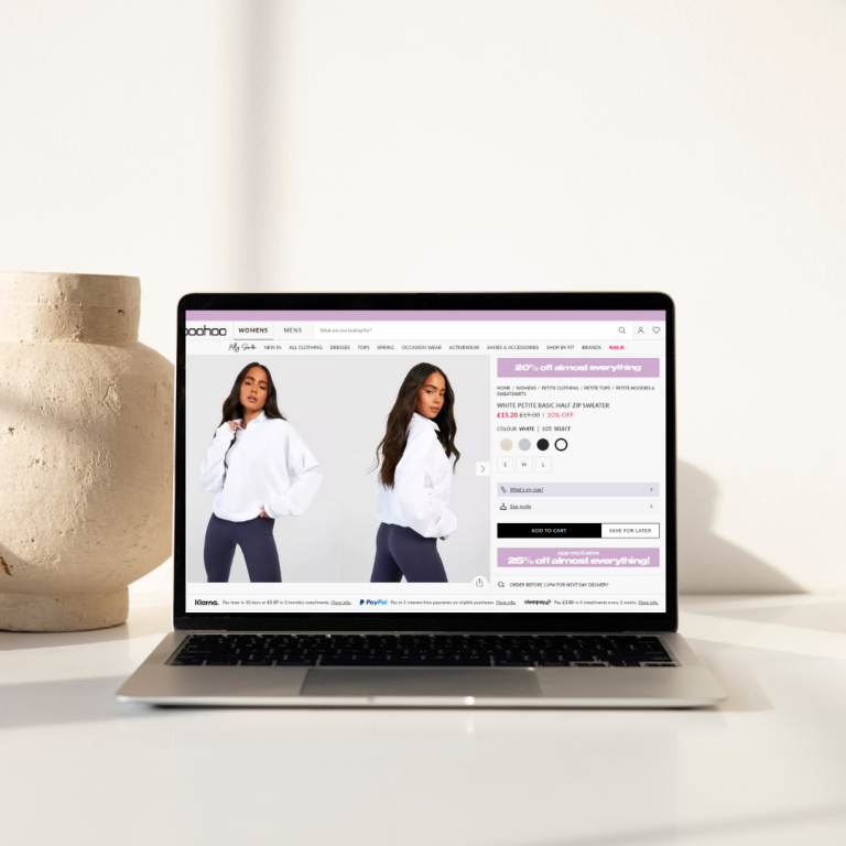
14. All colors and products variants
When you shop online, you will notice that the same product is available in different sizes, colors, materials and prices. These purchasing options are product variants.
A specific item that is grouped with related variants to form a distinct product is called a product variant. Product variants have unique identifiers, such as price, and each variant is based on the same product definition.
Each color, size or variety of a product should be easily accessible to visitors, who should be able to find it directly on the page. The more options you offer your customers, the more likely they are to find exactly what they are looking for.
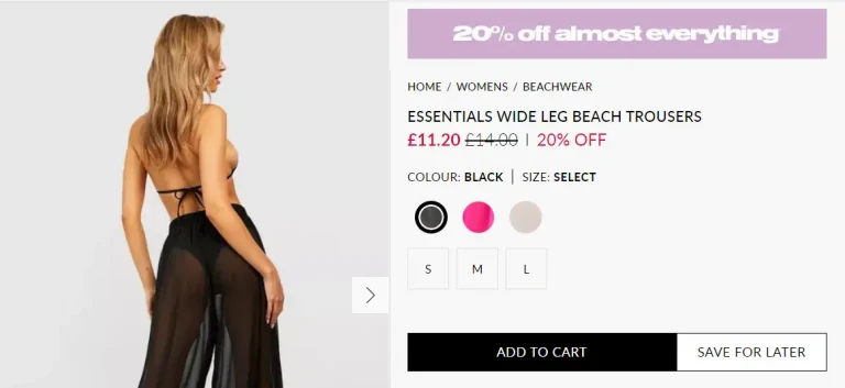
📷 Source : Boohoo
15. Complete product information
A comprehensive product description not only helps customers to discover more about the products on your website, it also increases the searchability of your products online.
When your product descriptions are detailed and include important information, they are more likely to appear at the top of search engine results.
So get creative and take the time to write something that will resonate with your audience.
This in itself will help you stand out from the competition, which adheres to tedious, auto-generated product descriptions.
Don’t be afraid to go in-depth: Studies have shown that longer text improves search and conversion performance of web pages.
16. Personalized product recommendations
Based on the illustration above, can you guess what the user intends to buy?
Product recommendations are the quintessential part of any e-commerce personalization strategy, in which products are dynamically suggested to a user on a web page, application or email, based on data such as customer attributes, browsing behavior or situational context, providing a personalized shopping experience.
Helping your customers find other products that might be right for them is a sure way to increase the average order value without being too pushy.
Adding similar products is just the beginning! What is encouraged is to add personalized product recommendations based on the current site visitor.
To further enhance product recommendations tailored to each site visitor, you can opt for on-site personalization platforms, where you can experiment with dynamic personalization based on real-time data. Verbolia offers a solution of product recommendation with personalization options that enable you to provide a customized shopping experience.
In a paid shopping campaign customer journey, product recommendations are not just important; they are absolutely essential. This is because your product pages act as the initial point of contact for visitors who directly arrive from search engines. If the main product fails to immediately capture their interest, there’s a heightened risk of bounce-back.
In this context, it’s crucial to prioritize and prominently display product recommendations. Unlike in a classic customer journey, where recommendations play a supportive role, in paid shopping campaigns, they take center stage. Ensuring that product recommendations are placed above the fold becomes imperative, maximizing their visibility and impact.
This is where a tool like Vmax proves invaluable.Vmax enables you to experiment with multiple product recommendation layouts for the visitors coming from shopping campaigns. Through automated testing, you can refine the user experience, ensuring that visitors are presented with the most compelling recommendations tailored to their preferences and needs. The result? A significant boost in ROAS for your shopping campaigns, as every interaction becomes an opportunity to drive conversions and increase revenue.
Additionally, even in the context of empty category pages, product recommendations remain very important. Although this subject deserves to be discussed in more detail, we encourage you to refer to our article on handling empty category pages for further information.
17. A section with all customer reviews
In the Spiegel Research study, 95% of shoppers reported reading online reviews before making a purchase. Not only do reviews encourage customer engagement, but they also help shoppers gather information, assess a product’s value and provide important validation for buyers considering “riskier” items, such as an expensive home gym or high-end electronics.
Bearing this in mind, your product page should have a section where all customer reviews of your product will be recorded and displayed.
Reviews are proven to be one of the most important factors influencing conversions, so having as many as possible is beneficial for both your visitors and your bottom line.
We highly advise you to use a collapsible section to keep the look of the page while allowing visitors to go deeper into the topic if they wish.
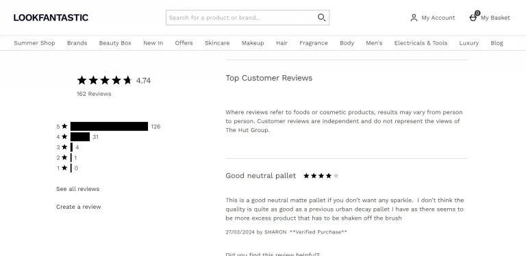
📷 Source : Lookfantastic
18. Frequently Asked Questions (FAQ)
One thing that all leading ecommerce companies have on their website is an FAQ section.
Have you ever wondered why?
This is because it is the first point of contact with potential buyers, effectively answering their most recurring questions. It builds trust and turns a visitor into a buyer by making the process easier. And, if done right, it can be useful to prospects and buyers at any stage of their buying journey.
Placing answers in a separate section of your product page will help you to:
- Simplify the customer service process
- Provide a richer user experience
- Improve the value and SEO performance of your product pages
- Address some of the major sales objections
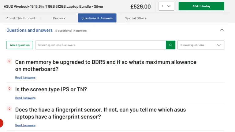
📷 Source : Argos
19. Detailed product specifications
In SEO, long-tail keywords are a mine of gold to increase organic traffic.. After all, long-tail keywords account for 70% of all monthly searches.
If you intend to steal a piece of the organic search pie, writing detailed, SEO-friendly product descriptions is a great way to rank for a set of long-tail keywords, which will ultimately help you generate additional organic search traffic with high purchase intent.
Spend some time thinking about how to qualitatively and quantitatively describe your product from every possible angle.
That is, all the product specifications you can get your hands on – and be sure to reach out to the people in your company who are an endless source of valuable information.
This technique is overlooked by many ecommerce business owners, even though the benefits are enormous.
20. Shipping and return policy information
For online stores that want to take it to the next level, we recommend creating a drop-down menu that comprehensively details your shipping and return policies.
Not only will this save you a lot of confusion, but search engines like to see this information on a product page.
Just having a small section at the top of the page providing key shipping information is enough to get things rolling:
- Expected delivery times
- Shipping costs
- Shipping methods
- Payment information
- Shipping restrictions
- International Shipping
Regarding the return policy, please make sure all bases are covered:
- Items that can be returned
- Exchangeable items
- Non-returnable and non-exchangeable products
- The time period during which your customers can return or exchange items purchased from your online store (e.g., 30 days from the date of purchase).
- The policy regarding the condition of returned items (e.g., slightly worn or with tags intact).
- How to request and obtain a return or exchange.
21. Easily accessible navigation menus at the bottom of the page
Rather than letting your customer leave, at the bottom of each product page, set up logical navigation menus to funnel some of your visitors to other pages.
The more pages your visitors visit in a session, the higher the probability of converting them into paying customers.
Most importantly, links in the footer serve three additional user experience purposes:
- They give site visitors an additional chance to perform the desired action. If you want visitors to sign up for your email list, view a product demo, or contact you, inviting them at the end of the scroll is an effective call to action, just like CTAs at the end of ads.
- They present a path to continued engagement. By including navigation links in the footer, you allow site visitors to continue exploring without forcing them to scroll up.
- They provide access to important information that is needed but should not be placed at the top of the list (for example, your copyright information, privacy statements and disclaimers).
22. Social proof and trust badges
With fraud and phishing being the scourge of e-commerce, the need to gain the trust of your visitors cannot be overstated. Visitors will only continue their buying journey if they trust the authenticity of your site.
Ask for ecommerce rewards and place them on your product pages – this social proof can give you just enough trust to tip the scales in your favor and convert another visitor.
23. Email registration form
Email marketing is crucial for e-commerce businesses, as it allows them to reach out directly to their customers without relying on social media algorithms or search engine rankings.
For every dollar spent on email marketing, you can expect an average return of $36.
In short, if you’re not already actively using this marketing channel to generate additional revenue for your ecommerce business, you’re missing out on the opportunity to grow your business.
You don’t even have to go to extraordinary lengths to start harnessing the power of email marketing. To get started, all you need to do is create a simple registration form – and you’re done.
Then, you won’t even have to lift a finger to see your subscriber count increase after spending about 30 minutes setting everything up.
24. Virtual waiting room
There’s a good chance you’ve stumbled upon a virtual waiting room in the past few months while shopping online. With online traffic skyrocketing over the past two years, the idea of having a digitalized lobby has begun to seep into mainstream ecommerce thinking.
This works especially well during high demand timed events like product launches or to manage unexpected traffic surges. A virtual waiting room acts as a safety net, protecting a website’s infrastructure from sudden spikes in online visits to prevent crashes and slowdowns. Online shoppers don’t see the waiting room under normal circumstances, but during these high demand moments they are redirected to a waiting room. And when their turn comes, the gleaming doors of the site reopen on a first-come, first-served basis.
On first impression, you may be wondering how you can incorporate everything we mentioned above into your product page layout.
But in reality, if you take a closer look at the most successful stores in your niche, you’ll notice that those at the top of their ecommerce game religiously follow this plan to dominate both the marketplace and the SERPs – while the rest join the ranks of struggling ecommerce businesses.
Will you revamp your product pages to make sure all of the listed elements are in place? This is a critical step that will undoubtedly have a positive impact on the success of your business.
All these elements have even more importance when your product page are used in shopping campaigns as they are used as landing pages. With Vmax, you can test different layouts and different product suggestions. Vmax will automatically test to find the best performing variant for each of your product pages depending on the product itself, the page interactions, the origin channel of the visitor, the device type or the time of the day. As a result you Improve conversion rate of your Paid campaigns.
Conclusion
On first impression, you may be wondering how you can incorporate everything we mentioned above into your product page layout.
But in reality, if you take a closer look at the most successful stores in your niche, you’ll notice that those at the top of their ecommerce game religiously follow this plan to dominate both the marketplace and the SERPs – while the rest join the ranks of struggling ecommerce businesses.
Will you revamp your product pages to make sure all of the listed elements are in place? This is a critical step that will undoubtedly have a positive impact on the success of your business.
If you’re investing in Google Ads with Google Shopping or Facebook Ads, even a 20% improvement in bounce rate on your product detail page can significantly impact your return on ad spend. This is where Vmax really helps out. With Vmax, you can transform your product detail pages into finely-tuned landing pages. Through automated layout creation and testing, Vmax ensures that each visitor lands on the most effective layout tailored to maximize conversion rates and reduce bounce rates.
About The Author
How can Verbolia help your e-commerce platform.